Let me show you how I went about creating the artwork for the game tiles in Snapshots: A Photo Journey (the board game I designed and produced to propose to Katy).
First and foremost, I had to pick the right memories. This meant diving into my photo collection. I relived those moments as I scrolled and felt my decision to propose to Katy being reinforced. As moments stood out, I pasted the photos into a Google doc to keep them organized. I made sure to pick memories from the three cities we’ve lived in during our relationship.
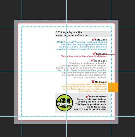
Before I could make the artwork in Photoshop, I needed to figure out what size the pieces would be. That depended on where I got the game produced. While I initially considered Board Games Maker to make the game, The Game Crafter eventually won me over. The way they let you organize all of the pieces as one game and the ease of their artwork upload tool made the choice clear for me.
Having chosen The Game Crafter, I started with their tile template in Photoshop. I aligned guides to the template’s safe zone so that I could hide the template and just work with the guides showing.
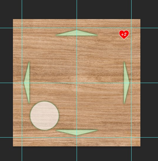
Being no expert in design, simplicity was key. I added a woodgrain background for that tabletop feel. To show which directions Katy could move, I added green triangular arrows on the good memory tiles, while red rectangles blocked movement onto the less pleasant memories. The good memories also had red positive heart values, and a circle for Katy’s game token. Conversely, the more challenging memories had black negative heart values and no place for Katy’s game token. To streamline the rest of the process, all these elements were saved in a “nav elements” layer, which allowed me to easily customize each tile from the original template.
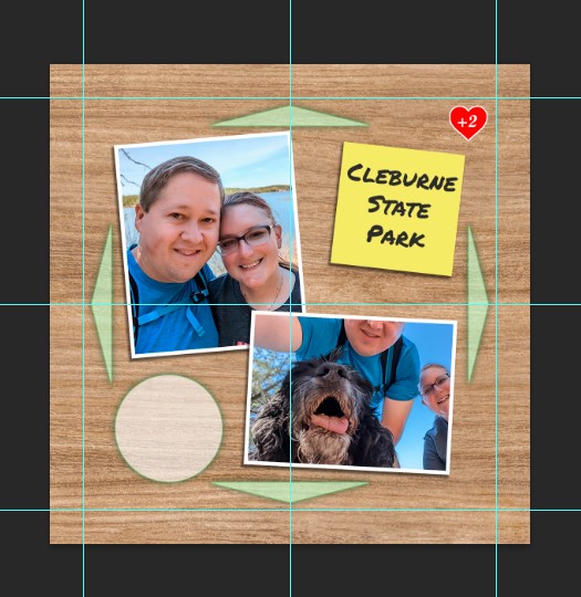
With the groundwork laid, it was time to add the photos. I chose two photos for each memory and placed them with a little bit of skew to look like we were going through photos together. I used layer styles to add a white border (stroke) and a drop shadow in an attempt to make them look more like printed photos. I drew a simple square to act as a post-it note to describe the memory: yellow post it notes for the good times and red for the challenging ones. Occasionally, I’d sprinkle in some extra details—a funny thought bubble, a joke grocery list, a bottle of Dayquil, or a wet floor sign for the time our washing machine decided to flood the apartment.

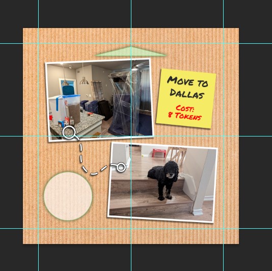
The “move” tiles were very similar but I used a cardboard background (to look like moving boxes) and used photos from where we moved from and where we moved to. The post it note was also updated to include the token cost for the move.
I probably went through and rechecked my photos, design elements, text and heart values 10 times to make sure there were no mistakes. So far we haven’t found any typos or messed up elements so I guess I caught all of my mistakes before uploading the artwork.